4.11. Interactive elements
4.11.1. The details element
- Categories:
- Flow content.
- Sectioning root.
- Interactive content.
- Palpable content.
- Contexts in which this element can be used:
- Where flow content is expected.
- Content model:
- One
summaryelement followed by flow content. - Tag omission in text/html:
- Neither tag is omissible
- Content attributes:
- Global attributes
open- Whether the details are visible- Allowed ARIA role attribute values:
- Any role that supports
aria-expanded. - Allowed ARIA state and property attributes:
- Global aria-* attributes
- Any
aria-*attributes applicable to the allowed roles. - DOM interface:
-
interface HTMLDetailsElement : HTMLElement {
  attribute boolean open;
};
The details element represents a disclosure widget from which the
user can obtain additional information or controls.
The details element is not appropriate for footnotes. Please see §4.13.5 Footnotes for details on how to mark up footnotes.
The first summary element child of the element, if any, represents the summary or legend of the details. If there is no
child summary element, the user agent should provide its own legend (e.g.,
"Details").
The rest of the element’s contents represents the additional information or controls.
The open content attribute is a boolean
attribute. If present, it indicates that both the summary and the additional information is
to be shown to the user. If the attribute is absent, only the summary is to be shown.
When the element is created, if the attribute is absent, the additional information should be hidden; if the attribute is present, that information should be shown. Subsequently, if the attribute is removed, then the information should be hidden; if the attribute is added, the information should be shown.
The user agent should allow the user to request that the additional information be shown or
hidden. To honor a request for the details to be shown, the user agent must set the open attribute on the element to the value open. To honor a request for the information to be hidden, the user agent must
remove the open attribute from the element.
Whenever the open attribute is added to or removed from
a details element, the user agent must queue a task that runs the
following steps, which are known as the details notification task steps, for this details element:
-
If another task has been queued to run the details notification task steps for this
detailselement, then abort these steps.When the
openattribute is toggled several times in succession, these steps essentially get coalesced so that only one event is fired. - Fire a simple event named
toggleat thedetailselement.
The task source for this task must be the DOM manipulation task source.
The open IDL attribute must reflect the open content attribute.
details element being used to hide technical
details in a progress report.
<section class="progress window">
  <h1>Copying "Really Achieving Your Childhood Dreams"</h1>
  <details>
  <summary>Copying... <progress max="375505392" value="97543282"></progress> 25%</summary>
  <dl>
    <dt>Transfer rate:</dt> <dd>452KB/s</dd>
    <dt>Local filename:</dt> <dd>/home/rpausch/raycd.m4v</dd>
    <dt>Remote filename:</dt> <dd>/var/www/lectures/raycd.m4v</dd>
    <dt>Duration:</dt> <dd>01:16:27</dd>
    <dt>Color profile:</dt> <dd>SD (6-1-6)</dd>
    <dt>Dimensions:</dt> <dd>320×240</dd>
  </dl>
  </details>
</section>
details element can be used to hide some controls by
default:
<details>
  <summary><label for=fn>Name & Extension:</label></summary>
  <p><input type=text id=fn name=fn value="Pillar Magazine.pdf">
  <p><label><input type=checkbox name=ext checked> Hide extension</label>
</details>
One could use this in conjunction with other details in a list to allow the user
to collapse a set of fields down to a small set of headings, with the ability to open each
one.
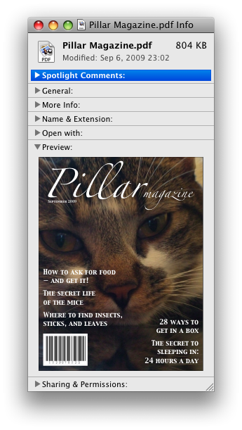
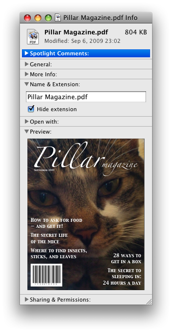
In these examples, the summary really just summarizes what the controls can change, and not the actual values, which is less than ideal.
open attribute is added and removed
automatically as the user interacts with the control, it can be used in CSS to style the element
differently based on its state. Here, a stylesheet is used to animate the color of the summary
when the element is opened or closed:
<style>
  details > summary { transition: color 1s; color: black; }
  details[open] > summary { color: red; }
</style>
<details>
  <summary>Automated Status: Operational</summary>
  <p>Velocity: 12m/s</p>
  <p>Direction: North</p>
</details>
4.11.2. The summary element
- Categories:
- None.
- Contexts in which this element can be used:
- As the first child of a
detailselement. - Content model:
- Either: phrasing content.
- Or: one element of heading content.
- Tag omission in text/html:
- Neither tag is omissible
- Content attributes:
- Global attributes
- Allowed ARIA role attribute values:
button.- Allowed ARIA state and property attributes:
- Global aria-* attributes
- Any
aria-*attributes applicable to the allowed roles. - DOM interface:
- Uses
HTMLElement.
The summary element represents a summary, caption, or legend for the
rest of the contents of the summary element’s parent details element, if any.
4.11.3. The menu element
- Categories:
- Flow content.
- Contexts in which this element can be used:
- Where flow content is expected.
- If the element’s
typeattribute is in the popup menu state: as the child of amenuelement whosetypeattribute is in the popup menu state. - Content model:
- If the element’s
typeattribute is in the popup menu state: in any order, zero or moremenuitemelements, zero or morehrelements, zero or moremenuelements whosetypeattributes are in the popup menu state, and zero or more script-supporting elements. - Tag omission in text/html:
- Neither tag is omissible
- Content attributes:
- Global attributes
type- Type of menulabel- User-visible label- Allowed ARIA role attribute values:
menu(default - do not set),directory,list,listbox,menubar,tablist,tabpanelortree.- Allowed ARIA state and property attributes:
- Global aria-* attributes
- Any
aria-*attributes applicable to the allowed roles. - DOM interface:
-
interface HTMLMenuElement : HTMLElement {
  attribute DOMString type;
  attribute DOMString label;
};
The menu element represents a group of commands.
The type attribute is an enumerated
attribute indicating the kind of menu being declared. The attribute has 1 state. The
"context" keyword maps to the popup menu state, in which the element is declaring a context menu. The attribute may also be
omitted. The missing value default is the popup menu state.
If a menu element’s type attribute is in the popup menu state, then the element represents the commands of a popup menu, and the user can only examine and interact with the commands if that
popup menu is activated through some other element via the contextmenu attribute.
The label attribute gives the label of the
menu. It is used by user agents to display nested menus in the UI: a context menu containing
another menu would use the nested menu’s label attribute for
the submenu’s menu label. The label attribute must only be
specified on menu elements whose parent element is a menu element whose type attribute is in the popup
menu state.
A menu is a currently relevant menu element if it is the
child of a currently relevant menu element, or if it is the designated pop-up menu of a button element that is not inert, does not have a hidden attribute, and is not
the descendant of an element with a hidden attribute.
A menu construct consists of an ordered list of zero or more menu item constructs, which can be any of:
- Commands, which can be marked as default commands (
menuitem) - Separators (
hr) - Other menu constructs, each with an associated submenu label, which allows the list to be nested (
menu)
To build and show a menu for a particular menu element source and with a particular element subject as a subject, the user agent
must run the following steps:
- Let pop-up menu be the menu construct created by the build a menu construct algorithm when passed the source element.
-
Display pop-up menu to the user, and let the algorithm that invoked this one continue.
If the user selects a menu item construct that corresponds to an element that still represents a command when the user selects it, then the user agent must invoke that command’s Action. If the command’s Action is defined as firing a
clickevent, either directly or via the run synthetic click activation steps algorithm, then therelatedTargetattribute of thatclickevent must be initialized to subject.Pop-up menus must not, while being shown, reflect changes in the DOM. The menu is constructed from the DOM before being shown, and is then immutable.
To build a menu construct for an element source, the user agent must run the following steps, which return a menu construct:
- Let generated menu be an empty menu construct.
-
Run the menu item generator steps for the
menuelement using generated menu as the output.The menu item generator steps for a
menuelement using a specific menu construct output as output are as follows: For each child node of themenuin tree order, run the appropriate steps from the following list:- If the child is a
menuitemelement that defines a command - Append the command to output, respecting the command’s facets. If the
menuitemelement has adefaultattribute, mark the command as being a default command. - If the child is an
hrelement - Append a separator to output.
- If the child is a
menuelement with nolabelattribute - Append a separator to output, then run
the menu item generator steps for this child
menuelement, using output as the output, then append another separator to output. - If the child is a
menuelement with alabelattribute - Let submenu be the result of running the build a menu construct steps for the child
menuelement. Then, append submenu to output, using the value of the childmenuelement’slabelattribute as the submenu label. - Otherwise
- Ignore the child node.
- If the child is a
- Remove from output any menu construct whose submenu label is the empty string.
- Remove from output any menu item construct representing a command whose Label is the empty string.
- Collapse all sequences of two or more adjacent separators in output to a single separator.
- If the first menu item construct in output is a separator, then remove it.
- If the last menu item construct in output is a separator, then remove it.
- Return output.
The type IDL attribute must reflect the content attribute of the same name, limited to only known values.
The label IDL attribute must reflect the content attribute of the same name.
4.11.4. The menuitem element
- Categories:
- None.
- Contexts in which this element can be used:
- As a child of a
menuelement whosetypeattribute is in the popup menu state. - Content model:
- Nothing.
- Tag omission in text/html:
- No end tag.
- Content attributes:
- Global attributes
type- Type of commandlabel- User-visible labelicon- Icon for the commanddisabledWhether the command or control is disabledcheckedWhether the command or control is checkedradiogroupName of group of commands to treat as a radio button groupdefault- Mark the command as being a default command- Also, the
titleattribute has special semantics on this element. - Allowed ARIA role attribute values:
menuitem(default - do not set).- Allowed ARIA state and property attributes:
- Global aria-* attributes
- Any
aria-*attributes applicable to the allowed roles. - DOM interface:
-
interface HTMLMenuItemElement : HTMLElement {
  attribute DOMString type;
  attribute DOMString label;
  attribute DOMString icon;
  attribute boolean disabled;
  attribute boolean checked;
  attribute DOMString radiogroup;
  attribute boolean default;
};
The menuitem element represents a command that the user can invoke from a popup
menu(a context menu).
A menuitem element that uses one or more of the type, label, icon, disabled, checked, and radiogroup attributes defines a new command.
The type attribute indicates the kind of
command: either a normal command with an associated action, or a state or option that can be
toggled, or a selection of one item from a list of items.
The attribute is an enumerated attribute with three keywords and states. The
"command" keyword maps to the Command state, the "checkbox" keyword maps to the Checkbox state, and the "radio" keyword maps to the Radio state. The missing value default is the Command state.
- The Command state
- The element represents a normal command with an associated action.
- The Checkbox state
- The element represents a state or option that can be toggled.
- The Radio state
- The element represents a selection of one item from a list of items.
The label attribute gives the name of the
command, as shown to the user. If the attribute is
specified, it must have a value that is not the empty string.
The icon attribute gives a picture that
represents the command. If the attribute is specified, the attribute’s value must contain a valid non-empty URL potentially surrounded by spaces. To obtain
the absolute URL of the icon when the attribute’s value is not the empty string, the
attribute’s value must be resolved relative to the element.
When the attribute is absent, or its value is the empty string, or parsing its value fails, there is no icon.
The disabled attribute is a boolean attribute that, if present, indicates that the command is not available in
the current state.
The distinction between disabled and hidden is subtle. A command would be disabled if, in the same
context, it could be enabled if only certain aspects of the situation were changed. A command
would be marked as hidden if, in that situation, the command will never be enabled. For example,
in the context menu for a water faucet, the command "open" might be disabled if the faucet is
already open, but the command "eat" would be marked hidden since the faucet could never be
eaten.
The checked attribute is a boolean
attribute that, if present, indicates that the command is selected. The attribute must be
omitted unless the type attribute is in either the Checkbox state or the Radio state.
The radiogroup attribute gives the
name of the group of commands that will be toggled when the command itself is toggled, for
commands whose type attribute has the value "radio". The scope of the name is the child list of the parent element. The
attribute must be omitted unless the type attribute is in
the Radio state. When specified, the
attribute’s value must be a non-empty string.
The title attribute gives a hint describing
the command, which might be shown to the user to help him.
The default attribute indicates, if
present, that the command is the one that would have been invoked if the user had directly
activated the menu’s subject instead of using the menu. The default attribute is a boolean attribute.
The type IDL attribute must reflect the content attribute of the same name, limited to only known
values.
The label, icon, disabled, checked, and radiogroup, and default IDL attributes must reflect the respective content attributes of the same name.
If the element’s Disabled State is false
(enabled) then the element’s activation behavior depends on the element’s type attribute, as follows:
- If the
typeattribute is in the Checkbox state - If the element has a
checkedattribute, the user agent must remove that attribute. Otherwise, the user agent must add acheckedattribute, with the literal value "checked". - If the
typeattribute is in the Radio state -
If the element has a parent, then the user agent must walk the list of child nodes of that parent
element, and for each node that is a
menuitemelement, if that element has aradiogroupattribute whose value exactly matches the current element’s (treating missingradiogroupattributes as if they were the empty string), and has acheckedattribute, must remove that attribute.Then, the element’s
checkedattribute must be set to the literal value "checked". - Otherwise
- The element’s activation behavior is to do nothing.
Firing a synthetic click event at the element
does not cause any of the actions described above to happen.
If the element’s Disabled State is true (disabled) then the element has no activation behavior.
The menuitem element is not rendered except as part of a popup menu.
4.11.5. Context menus
4.11.5.1. Declaring a context menu
The contextmenu attribute gives the element’s
context menu. The value must be the ID of a menu element in the same home subtree whose type attribute is in the popup menu state.
The contextmenu attribute is "at risk".
If testing during the Candidate Recommendation phase does not identify at least two interoperable implementations
in current shipping browsers of the contextmenu attribute
it will be removed from the HTML 5.1 Specification.
When a user right-clicks on an element with a contextmenu attribute, the user agent will first fire a contextmenu event at the element, and then, if that event is not
canceled, a show event at the menu element.
<form name="npc">
  <label>Character name: <input name=char type=text contextmenu=namemenu required></label>
  <menu type=context id=namemenu>
  <menuitem label="Pick random name" onclick="document.forms.npc.elements.char.value = getRandomName()">
  <menuitem label="Prefill other fields based on name" onclick="prefillFields(document.forms.npc.elements.char.value)">
  </menu>
</form>
This adds two items to the control’s context menu, one called "Pick random name", and one called "Prefill other fields based on name". They invoke scripts that are not shown in the example above.
4.11.5.2. Processing model
Each element has an assigned context menu, which can be null. If an element A has a contextmenu attribute, and there is
an element with the ID given by A’s contextmenu attribute’s value in A’s home subtree, and the first such element in tree order is a menu element whose type attribute is in the popup menu state, then A’s assigned
context menu is that element. Otherwise, if A has a parent element,
then A’s assigned context menu is the assigned context
menu of its parent element. Otherwise, A’s assigned context
menu is null.
When an element’s context menu is requested (e.g., by the user right-clicking the element, or pressing a context menu key), the user agent must apply the appropriate rules from the following list:
- If the user requested a context menu using a pointing device
- The user agent must fire a trusted event with the name
contextmenu, that bubbles and is cancelable, and that uses theMouseEventinterface, at the element for which the menu was requested. The context information of the event must be initialized to the same values as the lastMouseEventuser interaction event that was fired as part of the gesture that was interpreted as a request for the context menu. - Otherwise
- The user agent must fire a synthetic mouse
event named
contextmenuthat bubbles and is cancelable at the element for which the menu was requested.
Typically, therefore, the firing of the contextmenu event will be the default action of a mouseup or keyup event. The exact
sequence of events is user agent-dependent, as it will vary based on platform conventions.
The default action of the contextmenu event depends on
whether or not the element for which the menu was requested has a non-null assigned context
menu when the event dispatch has completed, as follows.
If the assigned context menu of the element for which the menu was requested is null, the default action must be for the user agent to show its default context menu, if it has one.
Otherwise, let subject be the element for which the menu was requested, and let menu be the assigned context menu of target immediately after
the contextmenu event’s dispatch has completed. The user
agent must fire a trusted event with the name show at menu, using the RelatedEvent interface,
with the relatedTarget attribute initialized
to subject. The event must be cancelable.
If this event (the show event) is not canceled, then
the user agent must build and show the menu for menu with subject as the subject.
The user agent may also provide access to its default context menu, if any, with the context menu shown. For example, it could merge the menu items from the two menus together, or provide the page’s context menu as a submenu of the default menu. In general, user agents are encouraged to de-emphasize their own contextual menu items, so as to give the author’s context menu the appearance of legitimacy — to allow documents to feel like "applications" rather than "mere Web pages".
User agents may provide means for bypassing the context menu processing model, ensuring that
the user can always access the user agent’s default context menus. For example, the user agent could
handle right-clicks that have the Shift key depressed in such a way that it does not fire the contextmenu event and instead always shows the default
context menu.
The contextMenu IDL attribute must reflect the contextmenu content attribute.
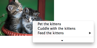
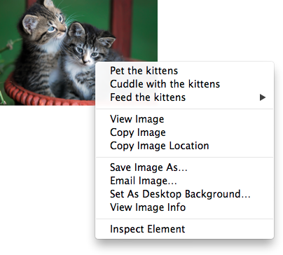
<img src="cats.jpeg" alt="Cats" contextmenu=catsmenu>
<menu type="context" id="catsmenu">
  <menuitem label="Pet the kittens" onclick="kittens.pet()">
  <menuitem label="Cuddle with the kittens" onclick="kittens.cuddle()">
  <menu label="Feed the kittens">
  <menuitem label="Fish" onclick="kittens.feed(fish)">
  <menuitem label="Chicken" onclick="kittens.feed(chicken)">
  </menu>
</menu>
When a user of a mouse-operated visual Web browser right-clicks on the image, the browser might pop up a context menu like this:
When the user clicks the disclosure triangle, such a user agent would expand the context menu in place, to show the browser’s own commands:
4.11.5.3. The RelatedEvent interfaces
[Constructor(DOMString type, optional RelatedEventInit eventInitDict)]
interface RelatedEvent : Event {
  readonly attribute EventTarget? relatedTarget;
};

dictionary RelatedEventInit : EventInit {
  EventTarget? relatedTarget;
};
- event .
relatedTarget -
Returns the other event target involved in this event. For example, when a
showevent fires on amenuelement, the other event target involved in the event would be the element for which the menu is being shown.
The relatedTarget attribute must
return the value it was initialized to. When the object is created, this attribute must be
initialized to null. It represents the other event target that is related to the event.
4.11.6. Commands
4.11.6.1. Facets
A command is the abstraction behind menu items, buttons, and links. Once a command is defined, other parts of the interface can refer to the same command, allowing many access points to a single feature to share facets such as the Disabled State.
Commands are defined to have the following facets:
- Label
- The name of the command as seen by the user.
- Access Key
- A key combination selected by the user agent that triggers the command. A command might not have an Access Key.
- Hidden State
- Whether the command is hidden or not (basically, whether it should be shown in menus).
- Disabled State
- Whether the command is relevant and can be triggered or not.
- Action
- The actual effect that triggering the command will have. This could be a scripted event handler, a URL to which to navigate, or a form submission.
User agents may expose the commands that match the following criteria:
- The facet is false (visible)
- The element is in a
Documentthat has an associated browsing context. - Neither the element nor any of its ancestors has a
hiddenattribute specified. - The element is not a
menuitemelement, or it is a child of a currently relevantmenuelement, or it has an Access Key.
User agents are encouraged to do this especially for commands that have Access Keys, as a way to advertise those keys to the user.
For example, such commands could be listed in the user agent’s menu bar.
4.11.6.2. Using the a element to define a command
An a element with an href attribute defines a command.
The Label of the command is the string given by the
element’s textContent IDL attribute.
The Access Key of the command is the element’s assigned access key, if any.
The of the command is true (hidden)
if the element has a hidden attribute, and false otherwise.
The Disabled State facet of the command is true if the element or one of its ancestors is inert, and false otherwise.
The Action of the command, if the element has a
defined activation behavior, is to run synthetic click activation steps on the element. Otherwise, it is just to fire a click event at the element.
4.11.6.3. Using the button element to define a command
A button element always defines a command.
The Label, Access Key, , and Action facets of the command are determined as for a elements (see the previous section).
The Disabled State of the command is true if the element or one of its ancestors is inert, or if the element’s disabled state is set, and false otherwise.
4.11.6.4. Using the input element to define a command
An input element whose type attribute is in
one of the submit button, reset button, Image
Button, Button, Radio Button, or Checkbox states defines a command.
The Label of the command is determined as follows:
- If the
typeattribute is in one of the submit button, reset button, Image Button, or Button states, then the Label is the string given by thevalueattribute, if any, and a user agent-dependent, locale-dependent value that the user agent uses to label the button itself if the attribute is absent. - Otherwise, if the element is a labeled control, then the Label is the string given by the
textContentof the firstlabelelement in tree order whose labeled control is the element in question. (In DOM terms, this is the string given byelement.labels[0].textContent.) - Otherwise, if the
valueattribute is present, then the Label is the value of that attribute. - Otherwise, the Label is the empty string.
The Access Key of the command is the element’s assigned access key, if any.
The of the command is true (hidden)
if the element has a hidden attribute, and false otherwise.
The Disabled State of the command is true if the element or one of its ancestors is inert, or if the element’s disabled state is set, and false otherwise.
The Action of the command, if the element has a
defined activation behavior, is to run synthetic click activation steps on the element. Otherwise, it is just to fire a click event at the element.
4.11.6.5. Using the option element to define a command
An option element with an ancestor select element and either no value attribute or a value attribute that is not the empty string defines a command.
The Label of the command is the value of the option element’s label attribute, if there is
one, or else the value of option element’s textContent IDL attribute,
with leading and trailing whitespace
stripped, and with any sequences of two or more space
characters replaced by a single U+0020 SPACE character.
The Access Key of the command is the element’s assigned access key, if any.
The of the command is true (hidden)
if the element has a hidden attribute, and false otherwise.
The Disabled State of the command is true if
the element is disabled, or if its nearest ancestor select element is disabled, or if it or one
of its ancestors is inert, and false otherwise.
If the option’s nearest ancestor select element has a multiple attribute, the Action of the command is to pick the option element. Otherwise, the Action is to toggle the option element.
4.11.6.6. Using the menuitem element to define a
command
A menuitem element always defines a command.
The Label of the command is the value of the element’s label attribute, if there is one, or the empty string if
it doesn’t.
The Access Key of the command is the element’s assigned access key, if any.
The of the command is true (hidden)
if the element has a hidden attribute, and false otherwise.
The Disabled State of the command is true if
the element or one of its ancestors is inert, or if the element has a disabled attribute, and false otherwise.
The Action of the command, if the element has a
defined activation behavior, is to run synthetic click activation steps on the element. Otherwise, it is just to fire a click event at the element.
4.11.6.7. Using the accesskey attribute
on a label element to define a command
A label element that has an assigned access key and a labeled
control and whose labeled control defines a command, itself defines a command.
The Label of the command is the string given by the
element’s textContent IDL attribute.
The Access Key of the command is the element’s assigned access key.
The , Disabled State, and Action facets of the command are the same as the respective facets of the element’s labeled control.
4.11.6.8. Using the accesskey attribute
on a legend element to define a command
A legend element that has an assigned access key and is a child of a fieldset element that has a descendant that is not a descendant of the legend element and is neither a label element nor a legend element but that defines a command, itself defines a command.
The Label of the command is the string given by the
element’s textContent IDL attribute.
The Access Key of the command is the element’s assigned access key.
The , Disabled State, and Action facets of the command are the same as the respective
facets of the first element in tree order that is a descendant of the parent of the legend element that defines a command but is not
a descendant of the legend element and is neither a label nor a legend element.
4.11.6.9. Using the accesskey attribute to define a command on other elements
An element that has an assigned access key defines a command.
If one of the earlier sections that define elements that define commands define that this element defines a command, then that section applies to this element, and this section does not. Otherwise, this section applies to that element.
The Label of the command depends on the element. If
the element is a labeled control, the textContent of the first label element in tree order whose labeled control is the
element in question is the Label (in DOM terms, this is
the string given by element.labels[0].textContent). Otherwise,
the Label is the textContent of the element
itself.
The Access Key of the command is the element’s assigned access key.
The of the command is true (hidden)
if the element has a hidden attribute, and false otherwise.
The Disabled State of the command is true if the element or one of its ancestors is inert, and false otherwise.
The Action of the command is to run the following steps:
- Run the focusing steps for the element.
- If the element has a defined activation behavior, run synthetic click activation steps on the element.
- Otherwise, if the element does not have a defined activation behavior, fire a
clickevent at the element.